George Rebane
We must always remember that more often than not the public mind is fickle, frantic, and foolish.
‘Tis again the polling season. We Americans are devoted to political polling results to tell us who or what is preferred by whom here and there. But very few of us know the nature of the polling beast, and what it is and is not telling us. Public opinion is a volatile phenomenon, it can change in an hour and most certainly does within several days given unfolding political events, statements, and media propaganda.
In this post I want to cover just one very important aspect of interpreting poll results. Specifically, what are we to make of the frequent reports of two closely competing proposals or candidate preferences being within ‘the margin of error’ from each other. Such a report basically tells us that that there is a good chance that the results are actually in the opposite order from those in the report – i.e. in the target population their order is switched. What we’d really like to see are robust preference percentages that reliably communicate who or what is currently the favored sentiment of the population polled. ‘Margin of error’ labels don’t communicate, and instead leave us confused and more likely to ignore the poll results.
But the realworld is what it is, and tightly run races almost always yield closely spaced results (percentages) when comparing the preferences for candidate/proposition A versus B. Specifically, when A% > B% and the difference A% – B% is small, what we’d really like to have reported is the probability or odds that A really is preferred to B in the polled population. Or its opposite, that in reality B is more likely preferred to A regardless of the numerical percentages reported. In the sequel, I’ll summarize how such a useful measure of reliability, called the switch probability PAB, may be calculated for any given poll (and should really be calculated by the polling outfit). A technical report on the development of the method to calculate PAB is documented in TR2409-1 which can be downloaded here Download TR2409-1_Polling 101.
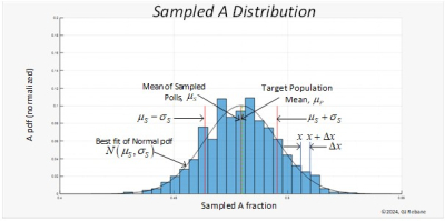
A poll result can be viewed as drawing a random variable RV from its probability distribution. If you could repeat the poll a large number of times the result of, say, the percentage preferring A can be displayed as a histogram shown below in Figure 1. Were we to repeat it again a gazillion times, we would get a slightly different shaped histogram. But all such histograms from a target population would have average (mean) values bunched around A%, the actual share of the target population that prefers A. And all of the histograms could be summarized by a familiar bell curve distribution with the sample mean μS, and standard deviation σS as shown.
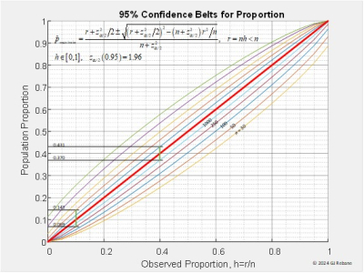
With two preferences, say, A and B, the report gives us A% and B%. Let’s assume that A% < B% and that the difference A% – B% is small, say, no more than a few percentage points. Before going further let’s explore the notion of confidence intervals. Given the A% from a poll the question becomes how close is this RV to the actual fraction fA of the target population that actually prefers A. This is answered by calculating the size of the interval around A% that contains fA with a certain probability, say, 95% or 0.95 confidence interval. These intervals can be calculated from probability theory and depend on the value of A% and the sample size (number of poll respondents). They plot graphically as the ‘banana curves’, well known to pollsters, quality control engineers, and other disciplines involved in designing sampled experiments.
To use the banana curves of Figure 2 we can look at a couple of examples. Suppose a poll with a 1,000 respondent sample reports A% = 40%, the observed proportion on the x-axis. From the figure we determine the lower bound for 0.95 confidence interval for a 1,000 sample size is 0.370 on the y-axis which displays the actual population proportions fA. The upper bound is obtained from the upper 1,000 sample banana curve at 0.431. From this we know that the real share preferring A in the target (sampled) population lies between 0.370 and 0.431 with 95% probability. A similar examination is carried out for A% = 10% calculated from a 250 sample size that gives the confidence interval between 0.069 and 0.143.
Now the difference A% – B% = AB% is also a random variable with its own distribution that derives from the overlap of the A% and B% distributions as shown in Figure 3 and explained in the downloadable TR2409-1. From these distributions we can calculate the desire PAB which is possible because the poll’s reported ‘margin of error’ MoE is approximately the confidence interval divided by two which equals to 2σS, twice the A and B standard deviations of the bell curve shown in Figure 1. This reduces to σS = MoE/2. So now if the reported A% < B%, the switch probability PAB that in the target we have A% > B% is calculated with the MS Excel™ spreadsheet formula
PAB ‘= NORM.DIST(0, |A% – B%|, MoE/2,TRUE)’
The ‘mean of the difference’ distribution (bell curve) is given by the absolute value |A% – B%| which is always positive. A little thought reveals that the quoted MoE captures the sample size and confidence level information in one number. So type into your spreadsheet the right hand side of the above formula starting with the equal sign. Insert |A% – B%| and the MoE as shown, hit Return, and out pops the switch probability PAB. Voila!
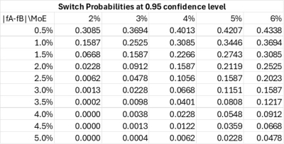
To demonstrate the working of the above formula, the table below gives PAB probabilities over ranges of |A% – B%| and MoE values that cover most reported poll results and obviate the use of the above formula.
Examining the table’s PAB values, we see that when the reported |A% – B%| = |fA – fB| is very small, say 0.5%, then PAB increases from 0.3085 to 0.4338 with increasing MoE values. This range of large switch probabilities will advise the reader to accept the poll’s result with some considerable caution. However, when the report has higher separation values for the two preferences, then the switch probabilities are smaller and can be pretty much negligible over the shown range of MoEs. For |fA – fB| = 5.0% we have PAB max out at 0.0478 for MoE = 6%.
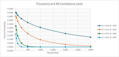
In Figure 3 we examine the impact of sample sizes directly on PAB. The four curves presented represent |fA – fB| values ranging from 1% to 8% in the vicinity of 0.45 preference shares.


Leave a comment