Rebane's Ruminations
February 2011
S M T W T F S
 12345
6789101112
13141516171819
20212223242526
2728  

ARCHIVES


OUR LINKS


YubaNet
White House Blog
Watts Up With That?
The Union
Sierra Thread
RL “Bob” Crabb
Barry Pruett Blog

George Rebane

Today the Board of Supervisors accepted the proposal by Switchback Public Relations + Marketing Inc to develop a county tourist promo website and spread the word that henceforth the following image will indelibly remind the prospective visitor of Nevada County and its manifest pleasures.  This shall be the case in perpetuity, or until one of us is brave enough to soak himself in gasoline, sit in the paved circle in front of the Rood Center, and light a match.
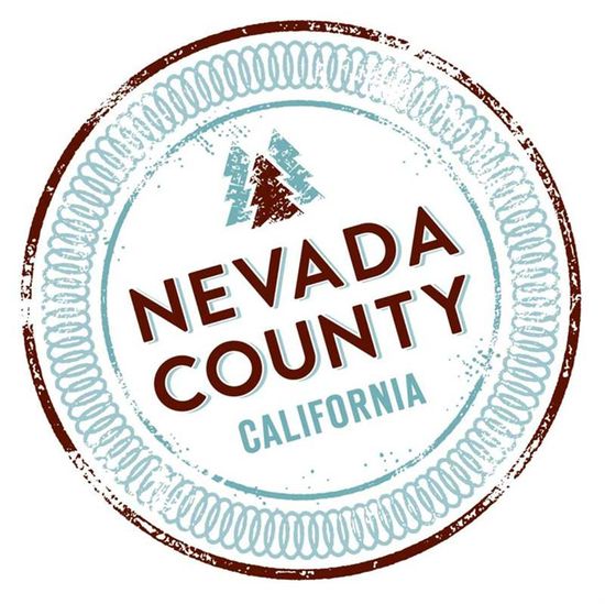
NCbrandFor more details, the well-intentioned people of Switchback also gave a PowerPoint presentation that must have had the desired effect on our Supervisors.  On 1 March 2011 you can see the fruits of their labors at http://gonevadacounty.com/presentation.

[update]  A correspondent sent me a copy of the PowerPoint presented to the BoS this morning.  You can download it here Download Power Point 2.22.11.

Posted in , , ,

22 responses to “The New Nevada County Brand – Really! (updated)”

  1. RL Crabb Avatar

    Looks like a dinner plate. You’d best watch out, George. Maybe it was designed to encourage you to incinerate yourself on the Rood Center steps. I’m sure there are some who would use the occasion to sell hot dogs and marshmallows to roast in your honor.

    Like

  2. Russ Steele Avatar

    When I saw this in the TV this morning, my initial response was oh my god I must have a lousy video monitor, the color pallet was so bland and the resolution was crap. Now I realized it was the original, not my high def computer monitor. We also know why Switchback Public Relations + Marketing Inc did not want any one to see this limp pathetic symbol of tourism industry in Nevada County before they showed it to the BOS, seeking approval. I listened to the psycho babble as to why these were the right colors for Nevada County, and almost spit our my coffee, the brown representing the earth and blue the sky. Well the earth and sky are everywhere, not just in Nevada County. I am sorry, but this is just pathetic!

    Like

  3. Russ Steele Avatar

    oops, should read “spit out my coffee”

    Like

  4. Rich Ulery Avatar
    Rich Ulery

    George & Russ,
    I attended the Bd. of Supervisors meeting this morning and viewed the entire presentation by Switchback. I agree that that the logo leaves much to be desired, and hopefully better ideas will surface to improve it. I believe that the Board and Switchback are open to these ideas. It was quite clear to all in attendance and emphasized by Supv. Owens that the process is “fluid”. Overall, I was quite impressed by the website and its features. It is very good representation of all that Nevada County has to offer. It will get better with time (and support from our business community). The logo should be improved and I think the opportunity for that to happen is there.

    Like

  5. George Rebane Avatar

    Rich, from your pen to God’s ear.

    Like

  6. D. King Avatar
    D. King

    Bob Said:
    “Looks like a dinner plate.”
    LMAO!
    Yeah, one that’s been run through the dish washer a buncha times.

    Like

  7. John Galt Avatar

    I think a little reduction in cordiality and a little increase in candor is needed here: The logo is a zero. It’s not inspiring. It’s not representative. It’s not memorable. It’s not attractive. It has none of the benefits that a logo should have.
    I hope people speak up, else we’ll be looking at this image for 25 years and spend a lot of money affixing it to every govt object in the County.
    I propose we have a contest for all K through 8th graders. $10 to enter the contest. The winner gets $500. We’ll have a new logo within a week.

    Like

  8. Aaron Klein Avatar

    As you know, I live a stone’s throw on the Placer County side of the line. However, I intend to visit Nevada County several times in the coming weeks, and if it would help, I’d be glad to give credit to this inspiring new logo.
    PS: I’ve seen WAY worse.

    Like

  9. Russ Steele Avatar

    Rich,
    I was watching on the video and had to go to a luncheon meeting before Switchback was finished with the presentation. Outside of the underwhelming logo that looks like a well used dinner plate I have the following notes:
    One, this a very sophisticated web site requiring high band width to function, it will not work well on a dial-up connection. With all the videos it is huge bandwidth hog. Let’s hope that all the visitors who are searching for vacation venues in Nevada County are broadband users.
    Two, there was no mention of a smartphone version. Smartphone use is gathering steam in the U.S. Forty percent of American adults use their cell phones to surf the Web, e-mail, or use instant messaging, according to a study from Pew Research Center in Washington. That’s up from 32 percent a year ago. “The smartphone has really penetrated the mainstream of American society,” says Aaron Smith, a Pew research specialist. In the first quarter, smart-phones accounted for 34 percent of all mobile handsets sold in the U.S., up from 31 percent in the fourth quarter of 2009, according to consultant NPD Group. Many young people 18-35 are giving up desk top and laptops for just a smart-phone. I will have to wait for the site to go on line to test smartphone access, but I predict this is not a smart phone friendly site. When I am tourist, I use my smart phone to find restaurants, stores and point of interest I am seeking. Given the above stats, so do 30 percent of all visitors to Nevada County. Since you were there for the presentation were there any mention of smartphone users version?
    Third and final thing that bothered me was that Switchback seems to setting themselves up with an annuity project, requiring them to make all the changes to the business data on the web site, except for the event calendars. One thing about these kinds of web sites, they have to be up to date to sustain user confidence. That is a huge challenge and the technology is available to make the businesses responsible for their own data entry with a couple of set templets. This makes them responsible for the data accuracy, not the County and their contractor.
    One feature that I really liked was the blog feature and comment by Switchback that the more blogs the site was linked to the higher the ranking on search engines. This will be an opportunity for us conservative blogger to attract more readers. Assuming that conservative will be allowed on the County Tourism Blog Roll. Stay Tuned, more to come.

    Like

  10. Kial Avatar

    Hmmm, much to be desired here with the chosen logo. To me, this one just doesn’t hook me as I think a proper logo should. BTW, George, do you know the password to get into the WordPress site?

    Like

  11. Mike Sherman Avatar

    The logo looks like a casino chip. I like John Galt’s suggestion, have a contest with the kids.

    Like

  12. George Rebane Avatar

    No, I have no more info on the upcoming website than is in the ppt presentation that the BoS saw this morning (see update). Hope this helps.
    And I also like John Galt’s suggestion. Having a county logo contest in the schools will undoubtedly produce a classic that will have a local pedigree which will add to the county lore with the passing of years.

    Like

  13. Dave C Avatar
    Dave C

    I agree with John Galt. Set up a competition among the local schools to design a logo and award a cash prize to the winner.

    Like

  14. Russ Steele Avatar

    I agree, an artistic 5th graders could come up with a better option than we got from Switchback. At least we would have the option of choosing among many entries rather that take what a paid contractor decide it should be. Was the County staff give options to choose from, or was it a one up take or leave it.
    Looking at the Power Point, I can not find any buttons to push that makes the web site smartphone friendly. In a world that is going mobile this is a huge mistake in the design. The web site should have been planned from the ground up to be mobile phone friendly.

    Like

  15. Russ Steele Avatar

    Looking at the power point, it appears to me that the Switchback Design is not ready for 2010. It is not mobil friendly with drop down menues, small dense text and mouse oriented subject selection. Here are some thoughts from Web Design Trends in 2011
    3. Mobile Ready
    Smartphones, iPads, netbooks, oh my! There’s a dizzying amount of mobile products available to the consumer in 2011. This means your web design must be responsive to multiple viewports.
    Creating a mobile ready website is not simply removing the bells and whistles from your design. This can create a vacant and impersonal design. Although not impossible, distilling the magic from your original design into a pure representation of your brand is tough! Fortunately, technology is quickly removing this burden.
    It may be tempting to just create a dedicated mobile site, but that may no longer satisfy your audience. Increasingly, mobile sites include the option to visit the original site. If you do not offer this option or if your original site is not optimized to mobile standards, you are simply not ready for 2011. Forecasters predict that smartphones will outsell personal computers this year. Bulletproof your design to meet this demand.
    5. Designing for Touch Screens, Not Mice
    Technology has become much more tactile. Usability is shifting from abstract to tangible. This means that instead of navigating your mouse to remotely connect, your destination is literally at your fingertips. Tablets, most smartphones and some desktops use touchscreens. Does your design accommodate fingertip navigation?
    How much of your design is mouse-oriented? As designers, we worship mice. Our links light up when the mouse hovers over. However, there’s no hovering in touchscreen. How will your design indicate links to your visitors? What about drop-down menus? That’s also a no-go in touchscreen design.

    Similarly, how will visitors peruse your site? As controversial as it may be for standard web browsing, horizontal scrolling may be more appropriate for touchscreens. Fitting nicely into this niche is a magazine-like layout where visitors virtually flip through your site.
    Lastly, consider using liquid layouts as part of your commitment toward responsive design. In 2011, you are no longer dealing with screen resolution size. Visitors can change their viewing orientation from vertical to horizontal. Your design must be flexible to meet any challenge, or you will be a relic of 2010.
    I think the County is about buy a 2010 relic.

    Like

  16. George Rebane Avatar

    The following contribution was emailed last night by a prominent NC resident and keen observer of the local scene:
    “How much did we have to pay for this piece of tripe? But then, watching the afternoon session of the on going drama reality show called “wasting time and the taxpayers money” I guess it all falls into place. Someone please tell me that we really did not have to pay for that logo. Please, please.”

    Like

  17. Russ Steele Avatar

    Check out the comments on the Union web page, totally negative. One e-mailer writes 100% negative. This does not bode well for the County. Who was in charge of this project? The rest of the Union article is in the paper only version. Anyone read the paper version. What did the Union have to say about the logo?

    Like

  18. George Rebane Avatar

    Yes, here’s the link to the Union’s article –
    http://www.theunion.com/article/20110222/BREAKINGNEWS/110229929&parentprofile=search
    But as Russ says about ‘boding well for the County’, this is a concern for what it portends for the group think that makes decisions for us at the Rood Center. Promoting NC tourism is something I have backed for years (as opposed to attracting manufacturers), and designing a program to do that would have several components – overall strategy, budget, marketing, implementing agents, etc. These can be divided into the touchy-feely parts and the technical parts. From what we have seen to date, it seems to me that this cart blew tires on both parts.
    So, was there someone in charge who could, perhaps, be retrained or seek another line of work? Or was this elephant designed by a PC-guided committee, or …?? My mind, of course, turns from this minor circus in the mountains to national healthcare, financial regulation, government promoted home ownership, and hundreds of other screw-ups. No wonder the Founders wrote the Constitution as a document to limit government powers.

    Like

  19. Russ Steele Avatar

    This project was run out of the County CEO’s office, it does not look like the IT Dept, who would have the smarts to manage this project, were involved. Duh?

    Like

  20. Mikey McD Avatar

    I, as one of the proverbial money trees which is being repeatedly financially harvested (read raped) by government on all levels I take offense to such wasteful spending. Is ‘economic development’ a service worthy of me paying taxes for? Talk about a vote of no confidence in the local Chamber of Commerce and local businesses (presumably with their own marketing plans)!
    America needs to have a serious debate about the role of government and the ‘services’ which require the taxing of us citizens.
    Until then, here’s to $50,000 round-about art, $25,000 winery signs peppering the area, $90,000 economic development websites….
    http://theeconomiccollapseblog.com/archives/government-waste-20-of-the-craziest-things-that-the-u-s-government-is-spending-money-on

    Like

  21. Greg Goodknight Avatar
    Greg Goodknight

    I’m going to guess, having looked at the slideware, that not a word is being said about the airports in Nevada County. Both of the main airports, Truckee-Tahoe (KTRK) and Nevada County/Grass Valley (KGOO) are accessible to many bizjets and most all propeller driven planes, have instrument approaches, automated weather reporting and aircraft services, yet they are pretty much ignored by the BoS except when they have to spend some of the money collected from airport users on something at KGOO. KTRK, which impinges also on Placer County, is an independent tax district and so hasn’t had to rely on our Supes to spend money collected from the airport on the airport.
    I was chatting with a biotech Venture Capitalist who loves western Nevada County at a local watering hole about a week ago. He was on a romantic getaway. He and his squeeze drove in despite having a bizjet and a late model high performance piston single available to him. Didn’t even know we had an airport just five miles from where we were sitting.
    It would help if there was better public transportation in and out of the airport, but the bus scheds are not airport friendly despite the department being located on the bottom floor of the airport admin building, on the airport property.
    Two dimensional thinking in a four dimensional world.

    Like

  22. Russ Steele Avatar

    We need some Zip cars stationed at the Airport. It seem to me that we should stop studying economic development and start taking some action. Let’s spend less money for economic studies and buy a couple of loaners for the airport, and then advertise the airport to high tech companies, at least companies that have access to corporate jets. Maybe when they discover we have a great airport, they might move some business in our direction. Just a thought.

    Like

Leave a comment